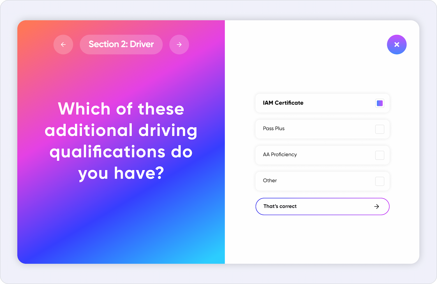
We collaborated with a leading UK motor insurance company to create a consistent design system for the flawless user experience. The design system was created simultaneously to web & mobile app development. The result was an omnichannel product revolving around three main components.

Multiple touchpoints
Web
Focused on onboarding clients and conversion optimisation.
Mobile app
Providing self-service post-purchase support of the motor policy.
Chatbot
Present in both the mobile and web experience, the chatbot was the first line of support for customers.

Designing for multiple brands
Creating a multi-brand structure in Figma was one of our most complex undertakings. We built the entire Design System from scratch, tokenized colors, typography and components. Tokens in design systems are a set of standardized, reusable values that help maintain consistency and scalability in a design.


Naming
For the web platform, we adopted a two-layered approach to tokenization due to its complexity and multiple colors in use. The first layer consisted of alias colors, while the second layer comprised system tokens, serving as the final tokens employed in the design and all components.

.jpg)
.jpg)
.jpg)