Vaisala
Vaisala is a global leader in measurement instruments and intelligence for climate action. The company produces industrial and weather measuring instruments monitoring indoor environment, biogas, liquids, pressure or temperature, to mention a few. Vaisala's devices and data improve resource efficiency, drive energy transition, and care for the safety and well-being of people and societies worldwide.

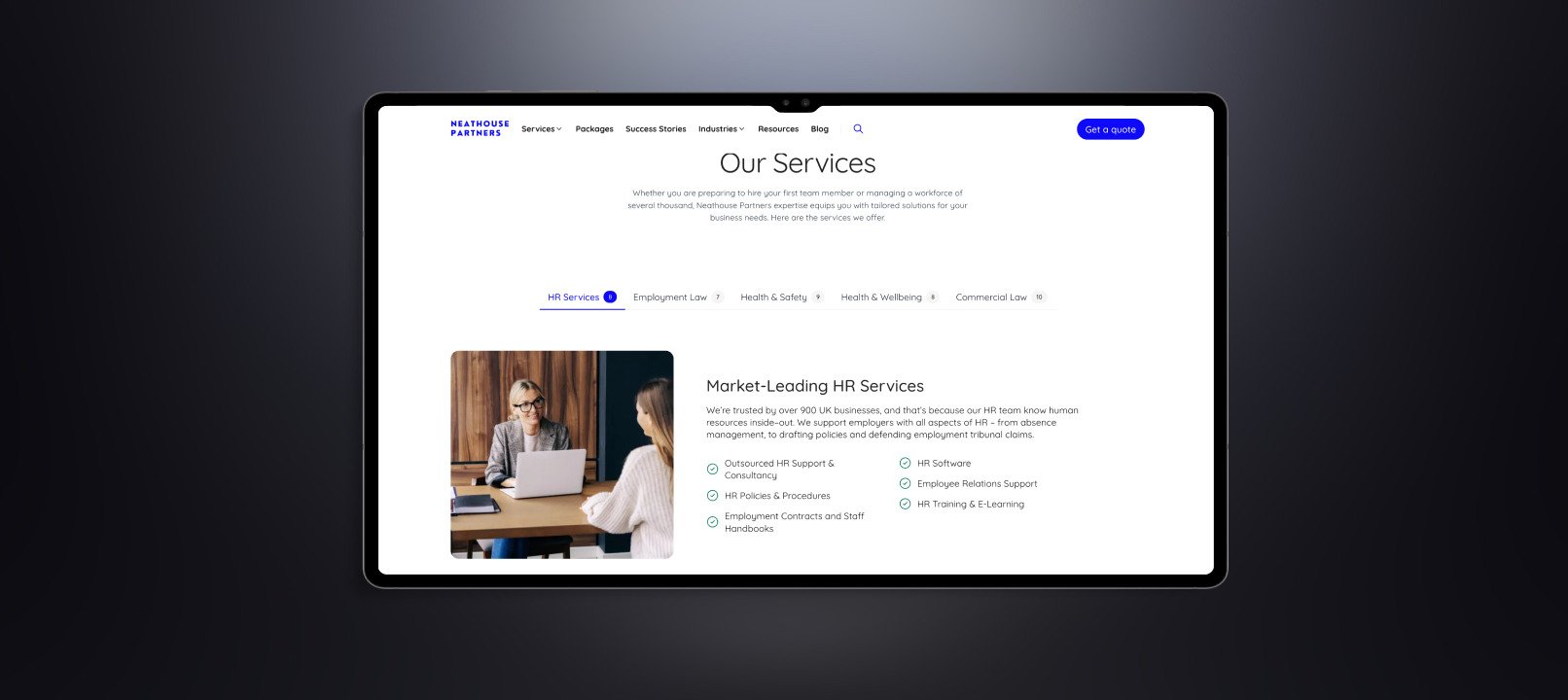
Vaisala's offering includes hundreds of product families, including digital ones. Thus the company created a design system that ensures UX consistency, helps maintain unique visual language intact, ease of development, reduced costs . The next step was to improve the visual quality by adding animations to digital interfaces, a motion design system that would work across multiple touchpoints. Tiny details that add life and dynamics and improve usability of an interface.
UI motion design concepts
The goal was to design the UI motion that would reflect the company's values and DNA. Both Unravel and Vaisala teams agreed on creating two approaches with documentation and implementation guidelines. It was super exciting as we found out during the 4-week collaboration, Vaisala, just like Unravel, is obsessed with great design of their products.
Concept A inspired by nature
We looked at a falling water droplet and the rising sun motion. The movements are smooth, organic, and natural.


Concept B inspired by human-made marvels
The golden ratio, as a versatile mathematical concept used in various fields of design and art, can be used to create aesthetically pleasing and balanced compositions. In motion, it can refine transition and timing balance.
Natural human motion consist 3 stages: breaking from stagnancy , raising acceleration, smooth landing.
Industrial machines are built to repeat this pattern in a much more exaggerated way. The best of them move fast and keep their precision on a perfect level for the whole time.
Motion in UI of high-end products should feel the same way.


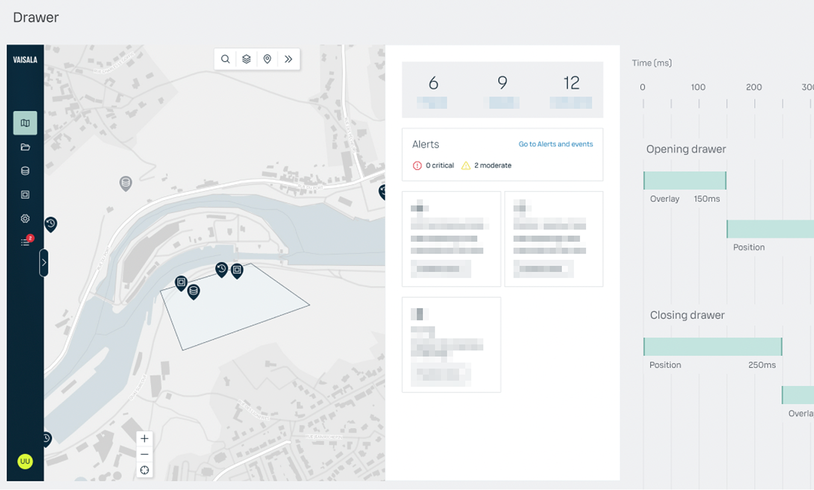
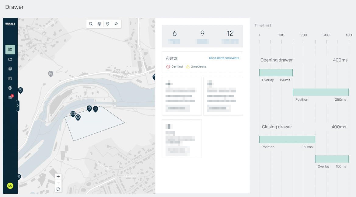
Harmony. The main motion transition. Used for objects exiting the screen or switching pages content. The curve starts slow, accelerates, and subtly slows down as it reaches the end.
Launch. Used for loading elements on the screen that appear in a sequence or after skeleton loaders. The curve launches the element rapidly and slows down toward the end.
Interactive. Universal pattern for elements that can be easily draggable. The curve is a spring with a subtle single wobble at the end.

For both of the concepts we delivered detailed guidelines for designing animations, like durations, transitions, easing, delays or loading settings. These also serve as a foundation for building complex interaction.
Accessibility
The design guidelines included recommendations to ensure all animations remain accessible to all users, including those with motion sensitivities or other accessibility needs.
Some of them are:
- Provide options to reduce or disable motion. Allow users to turn off or reduce animations through settings or preferences. This is crucial for those with vestibular disorders or motion sensitivity.
- Avoid animations that involve flashing or rapid color changes. This can trigger seizures in some users.
- Keep motion localized to the point of user focus rather than occurring across large portions of the screen.
- Keep animations subtle and purposeful. Avoid excessive or unnecessary motion that could be distracting or disorienting.
- Don't rely solely on motion to convey important information. Provide alternative ways to understand content and functionality.
Desktop and mobile dynamic prototypes
Curious how motion can enhance your digital product? Check the capabilities of our motion designers.

.jpg)